Clicki Brand Kit
Everything you need to represent the Clicki brand — logos, colors, typography, and the components that power our products.
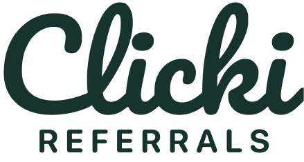
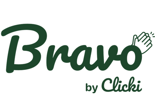
Logos
Use the appropriate mark for the product you're representing. Each logo is shown on both light and dark surfaces — keep clear space equal to the height of the mark.
Color palette
Our palette is anchored by a deep service-green primary and a signature lime CTA. Values below are pulled live from the production design tokens.
CTA Lime
--cta
hsl(78 100% 83%)
#E5FFA8
Primary
--primary
hsl(160 35% 22%)
#244C3F
Secondary
--secondary
hsl(75 70% 50%)
#ACD926
Accent
--accent
hsl(75 65% 88%)
#EAF4CD
Foreground
--foreground
hsl(160 30% 15%)
#1B322A
Background
--background
hsl(60 20% 98%)
#FBFBF9
Muted
--muted
hsl(60 10% 92%)
#EDEDE9
Typography
Lora for editorial headlines, Work Sans for everything functional, Inconsolata for code and data labels.
Lora
The quick brown fox
Used for hero headlines and editorial moments. Pair with generous line-height.
font-serif
Work Sans
The quick brown fox
Body copy, navigation, buttons, forms — the workhorse of the interface.
font-sans
Inconsolata
code & data
Reserved for code samples, IDs, and tabular data labels.
font-mono
Buttons & components
Live components from the production design system. The lime CTA is reserved for the single most important action on a screen.
Buttons
Badges
Card
Card title
Cards use a 12px radius, subtle border, and the soft shadow scale.
Voice & tone
Friendly, confident, service-business native. Lead with outcomes. Avoid jargon.
"Pay your customers the moment a referral closes."
"Leverage our omnichannel referral orchestration platform."